Viveka — 1:1 B2B SaaS Performance Coaching
Viveka is a SaaS learning-and-development platform that connects individuals and companies with a wide range of experts and tools. I designed the 1:1 coaching web application end to end — from stakeholder discovery and user research to a tested high-fidelity product.
- Domain
- Edtech, SaaS
- Client
- Viveka
- Role
- UI/UX Designer
- Timeframe
- 2020–2021
- Discipline
- 0→1, Coaching, Web Application
Overview
Viveka is in the business of “reimagining humanity” — helping companies and individuals reach their highest potential. It wanted an online presence for its learning platform: an easy-to-use web application with consistent branding and an interface that conveys the product’s purpose, values and culture, while creating room for real learning experiences.
The application had to work equally well for the two people on either side of a session — the coach and the mentee.
My role
The only designer on the project — from research and definition through to the tested visual design.
Understand the goals and objectives behind the product.
Project scope
I started with stakeholder conversations to understand the priorities behind the platform. Four concerns came up again and again.
- 01Usability
A smooth experience for both coaches and mentees was treated as non-negotiable.
- 02Mentee engagement
High drop-off would undermine everything else, so engagement and satisfaction had to stay a priority.
- 03Quality of coaches
Attracting and retaining qualified coaches — the platform’s reputation rests on it.
- 04Data & privacy
Both sides hand the platform sensitive information, so security had to be sound.
Data-driven design
Low retention is not unusual in the online-coaching space. Looking at existing 1:1 platforms surfaced a consistent set of weak points.
- 01Coach search
Makes it hard to find the right fit, pushing mentees to drop off early.
- 02Goal-setting
Heavier than it needs to be, which dents motivation.
- 03Scheduling
Inefficient and frustrating for both sides.
- 04The first session
Make-or-break for retention, and it’s under-supported.
- 05The coaching itself
Still rates highly — it’s the platform around it where the experience breaks down.
Talking to users
Interviews and a survey with both coaches and mentees pointed the same way: people want matching that goes beyond expertise, clear pricing, private data, and communication tools that actually work — plus support for different learning styles.
 Raveena GeorgeCoach
Managing a growing team and making sure campaigns meet mentee success metrics. My goal is to sharpen leadership skills and refine our strategy.
 Naresh KumarCoach
I see coaching as a career investment. A monthly subscription I can adjust as my needs change would work for me.
 Saimah TaimoorMentee
I’m aware of coaching platforms but haven’t used one. I’ve heard of the likes of Udemy but never explored them.
Problem statement
Grow a team and keep campaigns on track — without losing focus on leadership.
Flexible pricing, video sessions and quick messaging in between — from a platform I can actually find.
Research findings
A clear preference for 1:1 coaching over group formats — and a set of specific, fixable gaps.
- Coaching styles that don’t fit
- Missing functionality
- Low awareness of the platforms that already exist
Analyse the audience and gather insight to frame the problem.
Point of view
The research narrowed to one point of view — who the user is, what they need, and the insight that has to shape the product.
- User
A young professional in their twenties, early in their career
- Needs
coaching and real connections to build a career they’re still figuring out
- Insight
the mentors who could help are hard to reach — few local opportunities, no institutional network, and no obvious way in
How might we
HMW 01How might we help people reach their own definition of 1:1 coaching?
- Ask what they want from coaching — outcomes, challenges, what success looks like
- A space for ongoing dialogue between sessions
- Virtual check-ins on progress and adjustments
- A secure, private platform people can trust
HMW 02How might we help coaches work toward their goals?
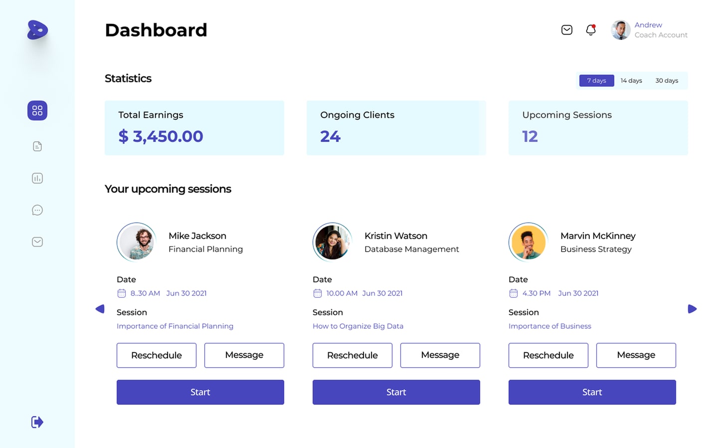
- One dashboard across all assigned mentees
- Key metrics, milestones and upcoming sessions
- Sessions designed around the skills each mentee needs
- Tools to give feedback after every session
HMW 03How might we help mentees work toward theirs?
- Short-term and long-term objectives, together
- A step-by-step action plan to reach them
- Recommended online programmes to follow
- Guidance on networks and professional presence
User journey map
The mentee’s path from landing on the site to reflecting after a session — and how it feels at each step.
Sketch the flows, build wireframes, and prototype.
Wireframes
Wireframes worked through the core flows — finding a coach, setting goals, booking and running sessions, and messaging in between.
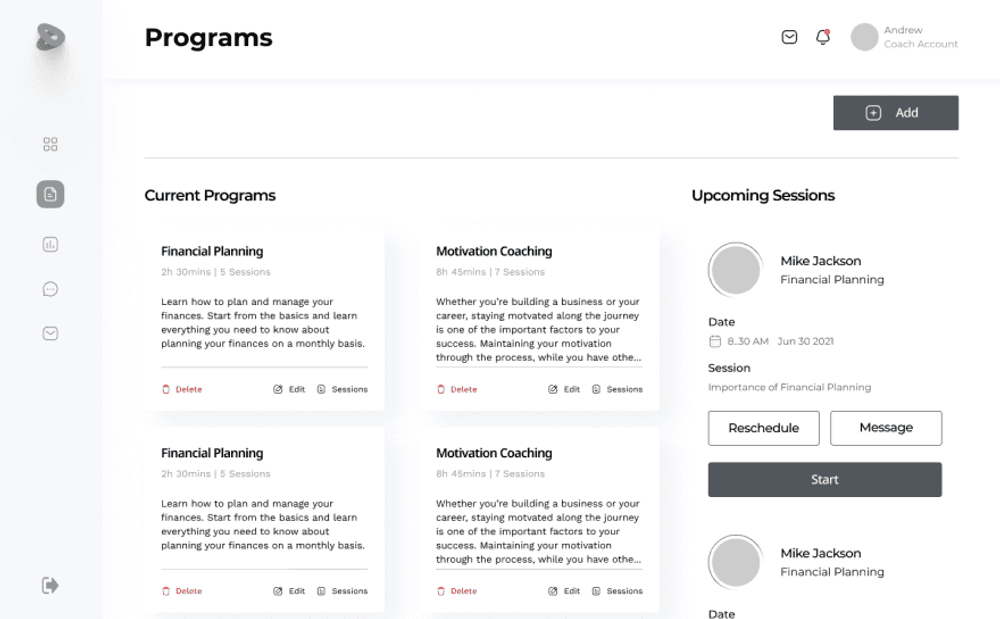
Coach — programs & sessions 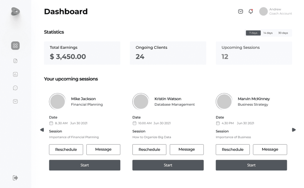
Coach — dashboard 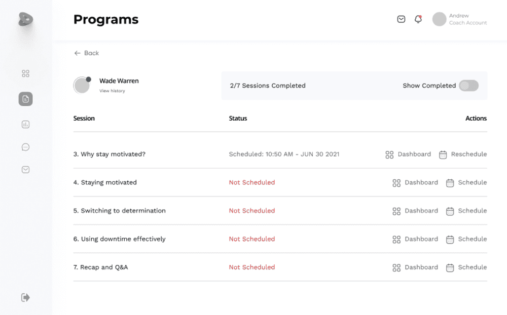
Program — session tracker 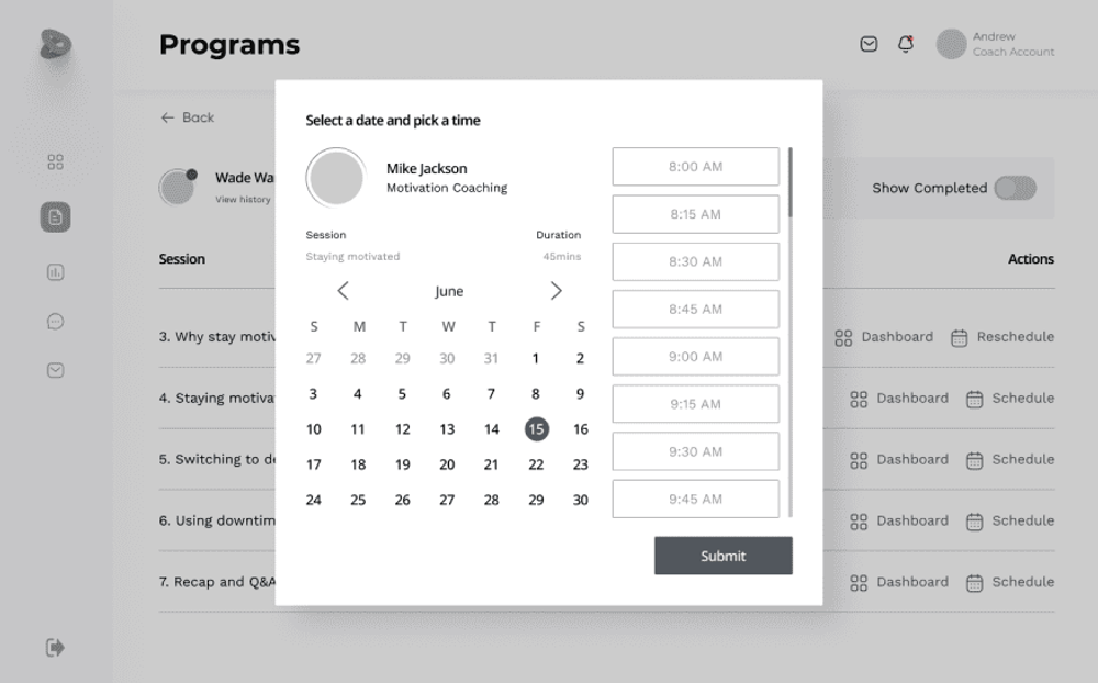
Booking — date & time 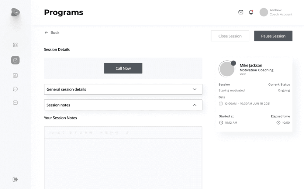
Live coaching session 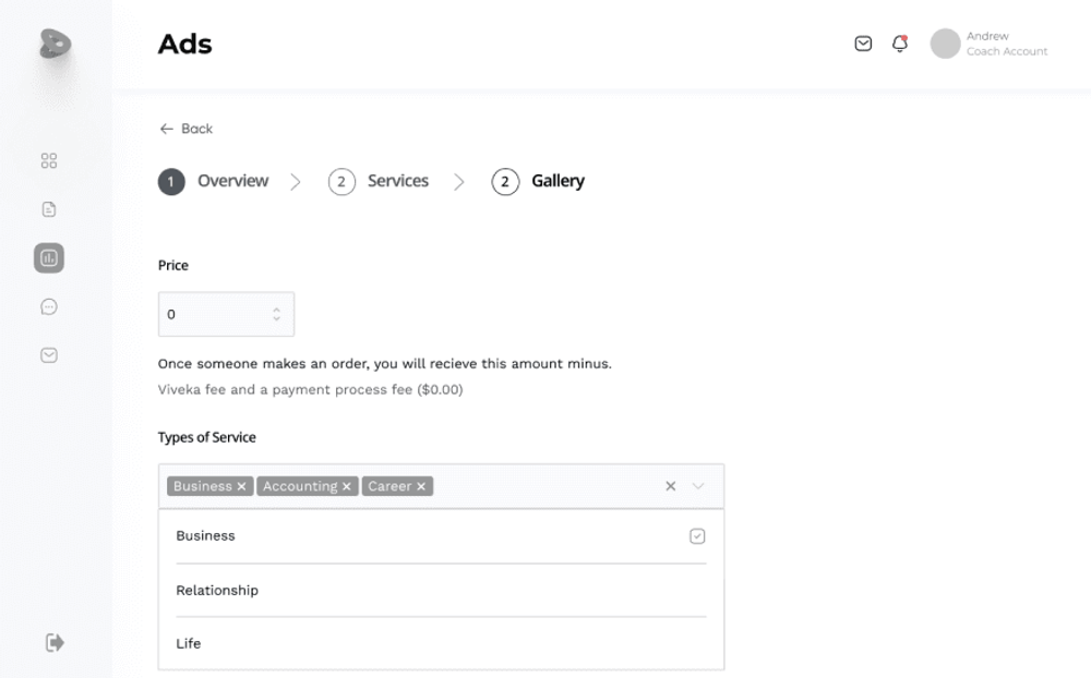
Service listing setup
Style guide
A style guide then fixed the type, colour and components the visual design would build on.
- Light
- Regular
- Medium
- Bold
- Heading 156/61.6
- Heading 248/52.8
- Heading 340/44
- Heading 432/35.2
- Body Default18/26.4
- Body Small14/22
- Indigo#5A58C8
- Violet#7B4FCA
- Orchid#A65FD9
- Lavender#DDCCEE
- Ice#EAF9FF
- Cloud#E6E6E8
Pull it together into a finished, tested product.
Visual design
The high-fidelity product — the flows a coach lives in day to day, built out from the style guide.
Coach — dashboard 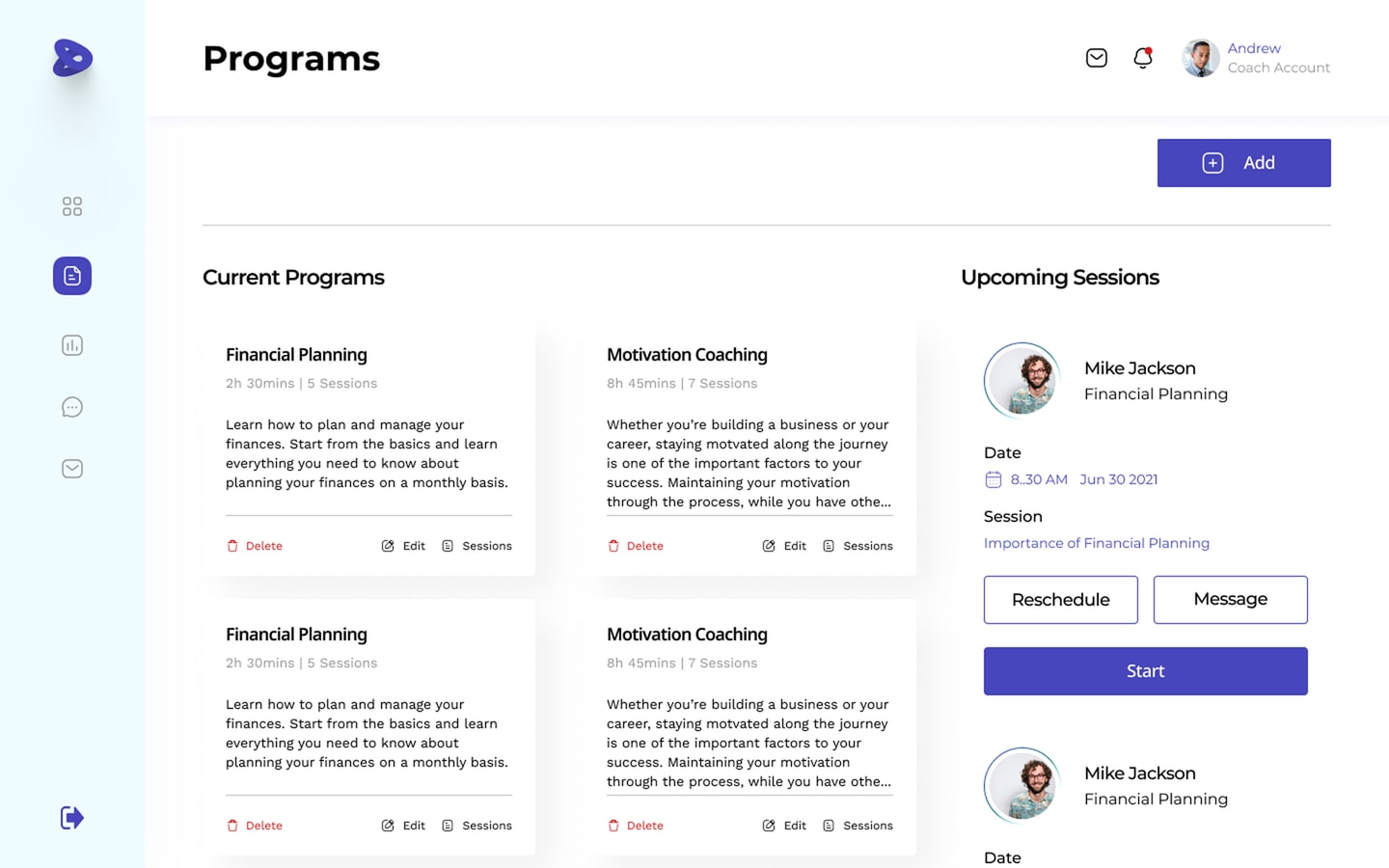
Coach — programs 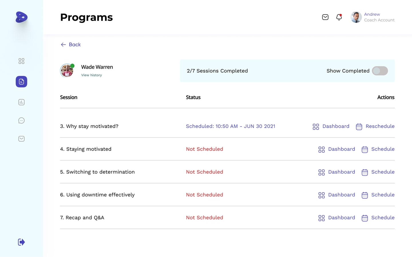
Program — session tracker 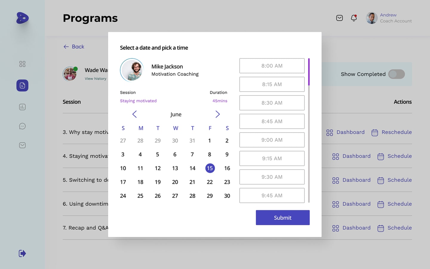
Booking — date & time 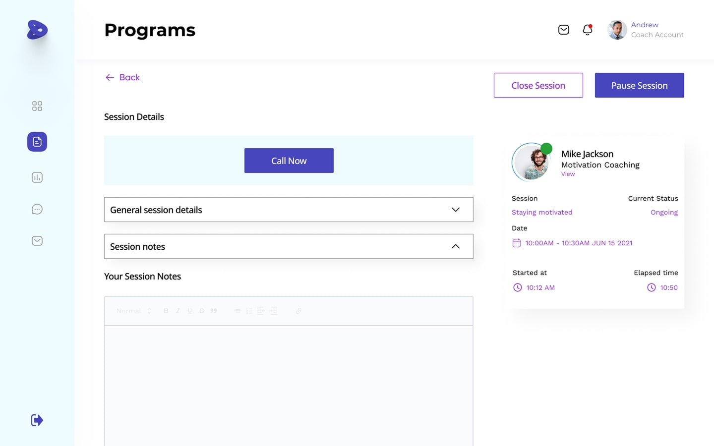
Live coaching session 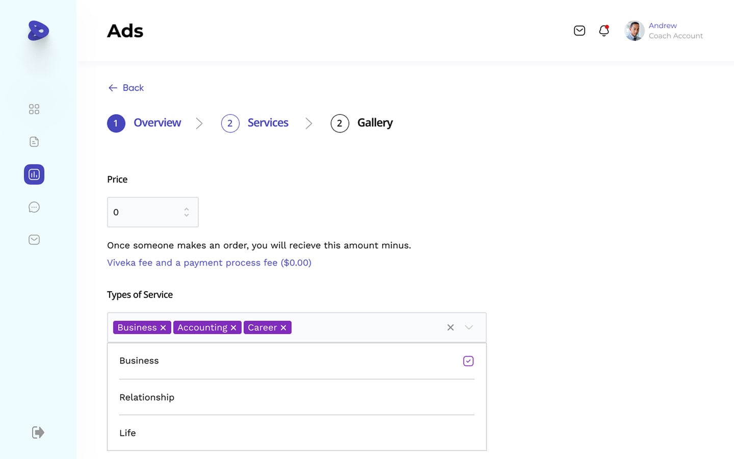
Service listing setup
Usability testing
I tested a high-fidelity working prototype with seven users through Maze — close enough to a real interaction to trust what it showed:
Engagement in video-call sessions was high — people found the format convenient for learning.
The integrated messaging system was widely praised: quick questions, instant updates, time saved.
People new to coaching platforms found the interface friendly and easy to navigate.
The flexible monthly subscription read as good value — budget control without losing access.
I found the video call feature extremely convenient for coaching sessions. It made the learning experience feel more engaging and effective.
Participant 1 The integrated messaging system was a lifesaver — quick questions and instant updates through the entire coaching process. It saved me a lot of time.
Participant 2 As someone new to coaching platforms, I appreciated the simplicity of the interface. I didn’t feel overwhelmed — it let me focus on my learning goals.
Participant 3 The flexible monthly pricing was a game changer. It gave me the freedom to manage my budget while still having access to valuable coaching resources.
Participant 4
Averaged across every task in the test — seven participants working through a high-fidelity prototype in Maze.
Retrospective
Signing off — looking back at the process, a few takeaways stuck with me:
Data drives UX
Using research data to prioritise needs and pin down pain points made the visual design that followed far simpler.
Research vs. design
It matters to strike a balance between the two — both count when you’re designing for a real user.
Never assume
Validate assumptions. The problems you imagine users have often aren’t the ones they actually experience.