BitDelta Exchange — Wallet Redesign
BitDelta Wallet prioritises the safety of assets, using cutting-edge security to keep crypto protected. Buy, sell and trade with ease — an intuitive interface makes navigating the market a smooth experience.
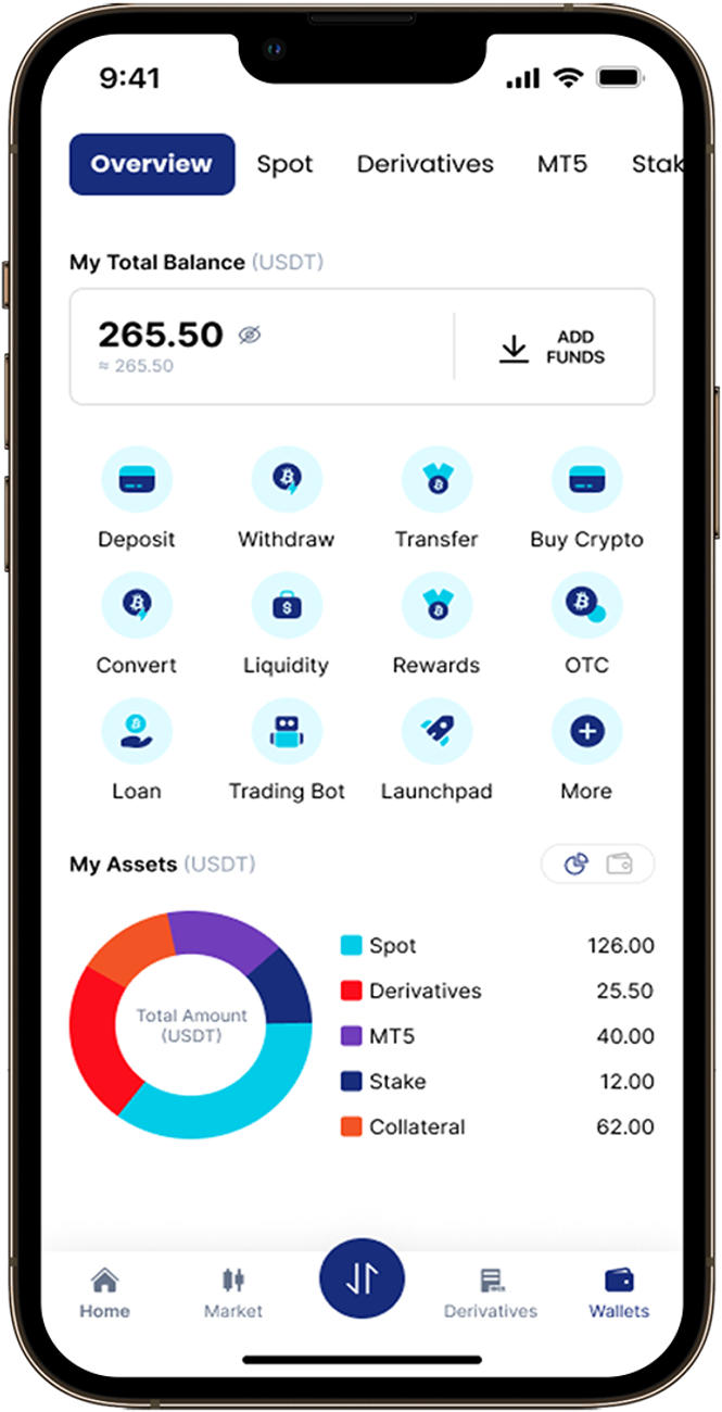
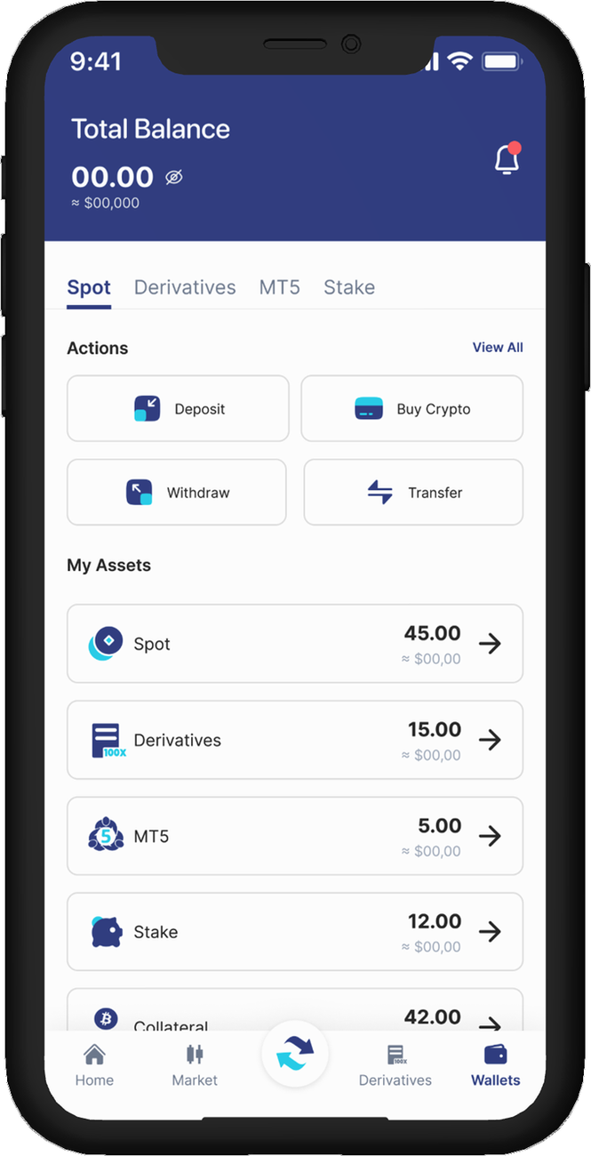
- Domain
- Fintech, Web3
- Role
- Product Designer
- Timeframe
- Q2 2023
- Discipline
- Web3, Blockchain, Mobile application
About BitDelta
BitDelta Wallet makes crypto approachable — fast, secure and easy to use. It bridges the complexity of a full exchange with everyday usability, so beginners and power users can both manage their assets with confidence.
What Role Did I Play?
I led the end-to-end design, working with the product manager and co-founders on positioning, experience and visual direction. Over an intensive three-month phase I collaborated with fellow designers, engineers, data analysts and content writers to translate product goals into a cohesive, user-centric solution.
 That’s me
The Problem
Drag the slider to compare the existing wallet home with the redesign.
- 32%drop-off
Users struggled to read their balance, fund breakdown and next best action — unclear hierarchy made the experience feel slow and opaque.
- 12%friction during transactions
Making a transaction meant a long, content-heavy path — several screens of fees, network choices and confirmations to move through before anything went out.
- 74%Delivery
Faster delivery, by aligning design sprints with engineering readiness.
- 3×↑Speed
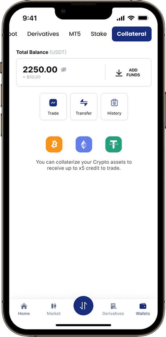
Faster task completion in key journeys like collateral.
- 140+↑Scale
Screens designed across end-to-end journeys.
- 6↑Coverage
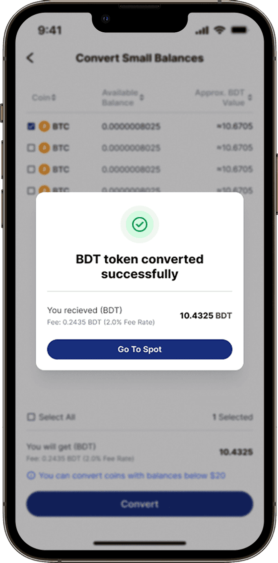
End-to-end journeys created, including Spot, Derivatives and Convert.
Research
I analyzed Google Analytics data alongside App Store and Google Play reviews to understand what customers were actually struggling with. I then interviewed users to validate and pressure-test those findings. Four key themes emerged.
The app feels more complicated than it needs to be. The most important information isn’t obvious.
Sending crypto took way too many steps. I just wanted to enter the amount, review the details, and send.
I know what I want to do, but the app makes me go through too many steps to get there.
Key Insights From Potential Users
After running tests and talking to users about the BitDelta wallet section — crypto novices and power users alike — four areas for improvement stood out.
Lack of Clarity Between Wallet Types
Users often struggle to understand the purpose and difference between wallet types. Terms like Spot, Funding, Margin, Earn and Futures can be overwhelming.
No Unified View of Portfolio Performance
The app fails to provide a single, consolidated view of total balance across all wallets, including real-time performance. Users have to switch between wallets to work out their total worth.
Overwhelming Interface for Beginners
The wallet presents every feature up front, with no contextual hierarchy, customisation or user segmentation.
Buried or Inaccessible Key Actions
Critical actions like Convert, Transfer, Deposit and Withdraw are often hidden inside menus or placed inconsistently across wallet sections.
Ideation
I brought the team together around the four insights and reframed each as a “how might we” — make wallet types self-explanatory, give people one view of their money, keep the core actions within reach, and lighten the load for first-time users. Sketching against those prompts, we settled the structure: six areas and the flows through them.
- Balance
- Assets
- Allocation
- Activity
- Coins
- Search
- Convert
- Spot
- Derivatives
- Staking
- Deposit
- Buy crypto
- Funding methods
- Spend
- Receive
- Payment
- Confirm
- Coin
- Network
- Address / QR
- History
- Spot
- Derivatives
- Staking
- Rewards
- OTC
- Loan
- Launchpad
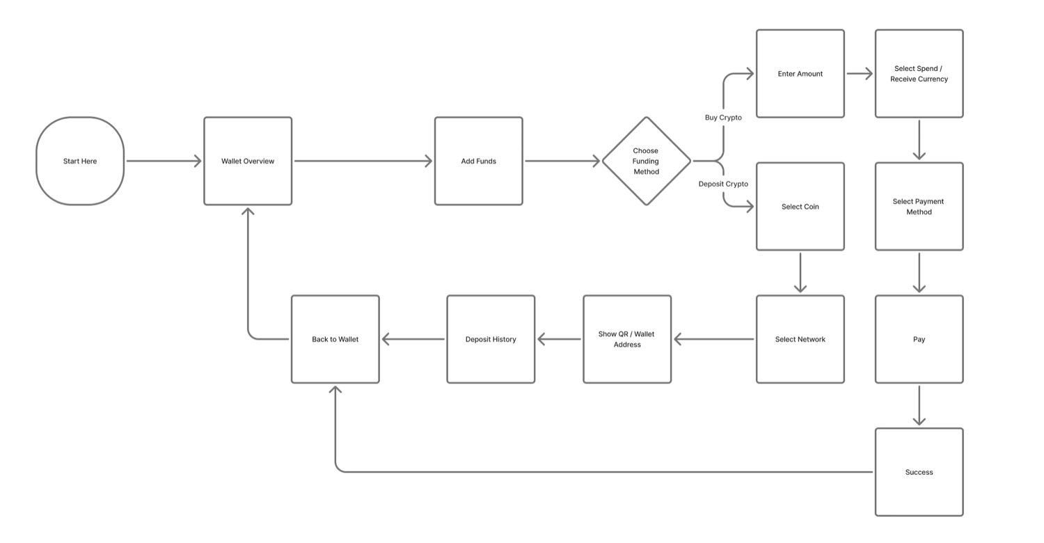
User Flow Diagram
I re-mapped the wallet’s information architecture end to end — every wallet type, every core action, and the paths between them. Three structural decisions came out of it.
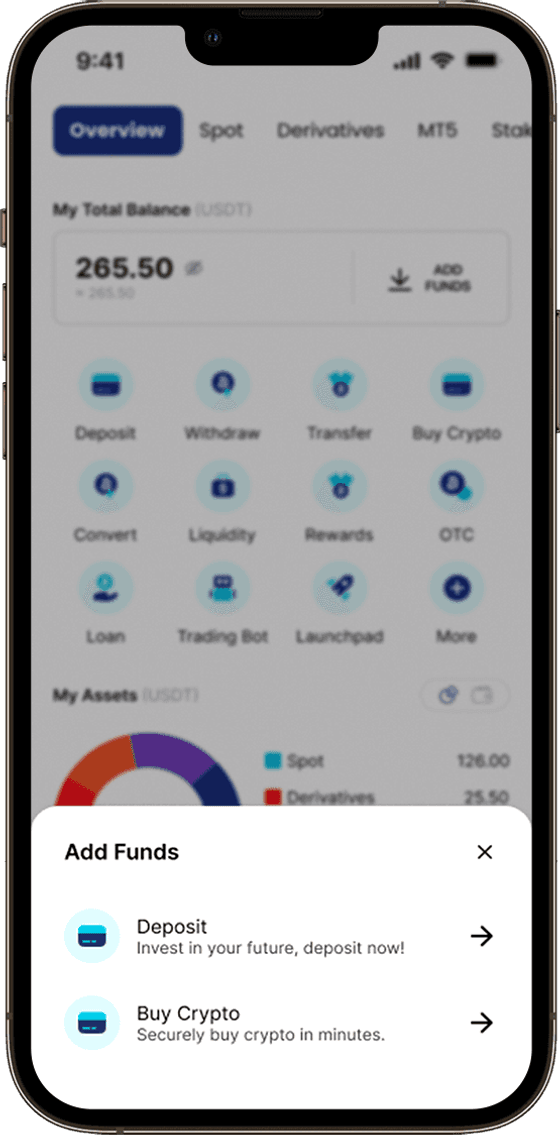
- Collapse the scattered entry points for the core actions into one consistent set, reachable from every wallet screen.
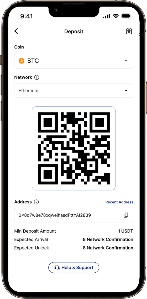
- Shorten the transaction flows — fewer steps, with fees and network choice shown inline instead of on a separate screen.
- Route everything through a single portfolio hub instead of five parallel wallet views.
Conceptualization and Low-Fi Wireframes
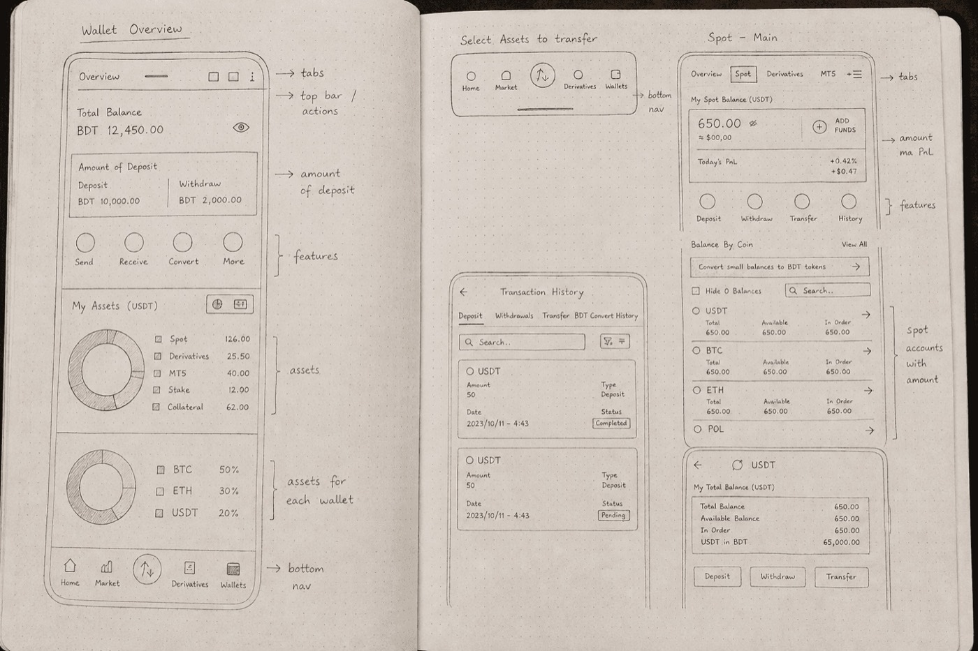
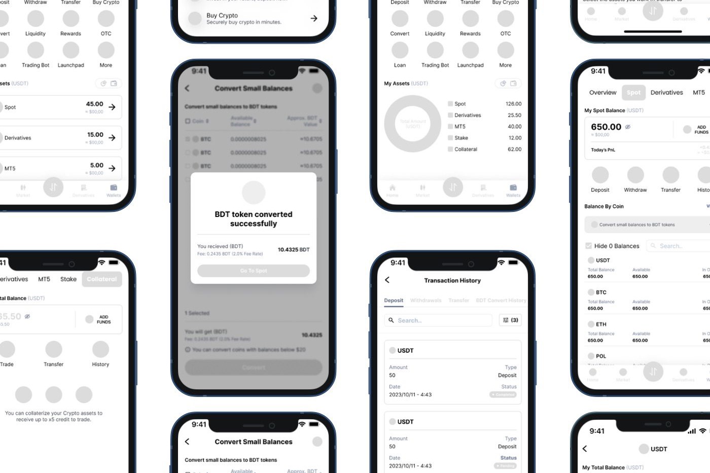
Low-fidelity layouts let me pressure-test the bigger bets quickly, on paper and in Figma, before committing:
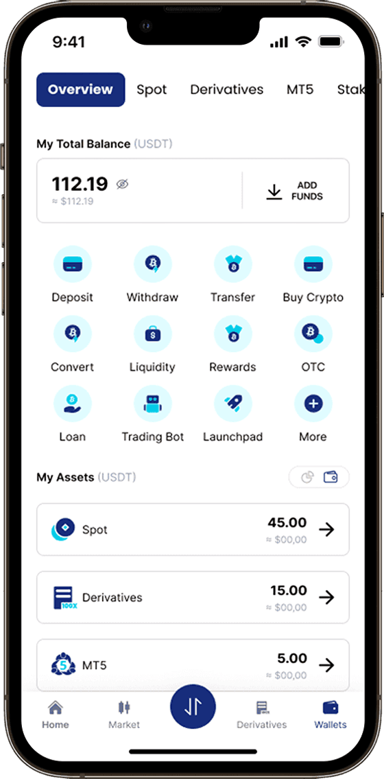
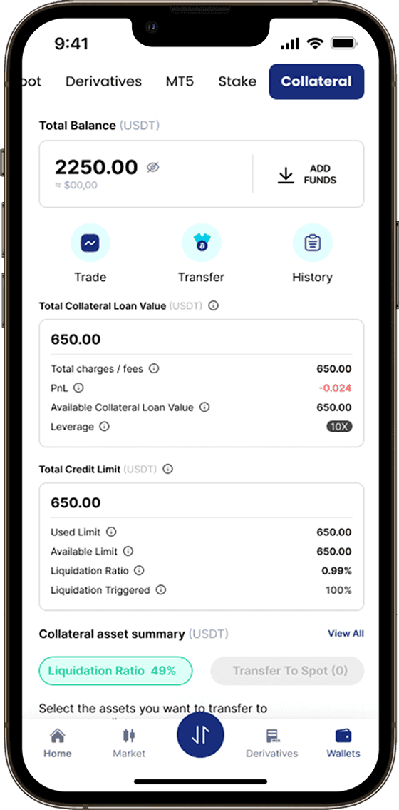
- A consolidated total balance and performance summary at the top of the home screen.
- Wallet types as a scannable, plain-language list — each with its balance and a one-line description — instead of unlabelled tabs.
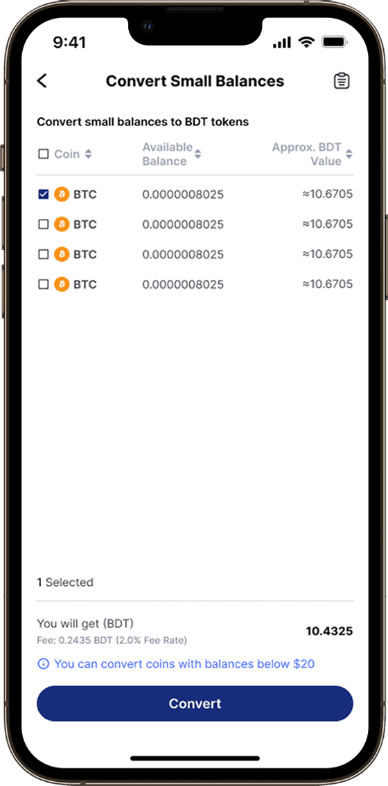
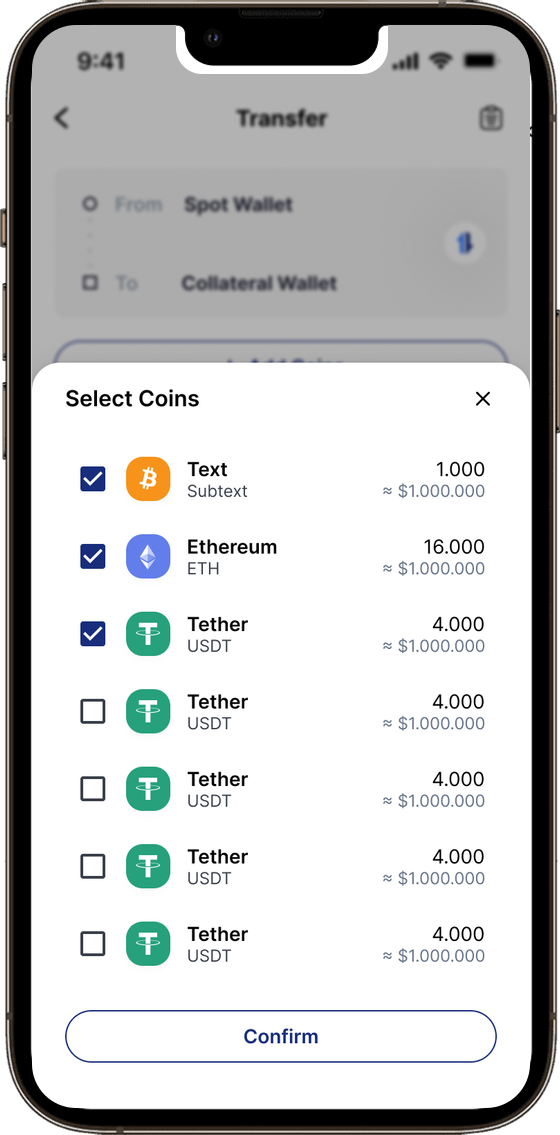
- The key actions surfaced on the home screen, with advanced controls one level down.
Designing a Simple and Manageable Experience
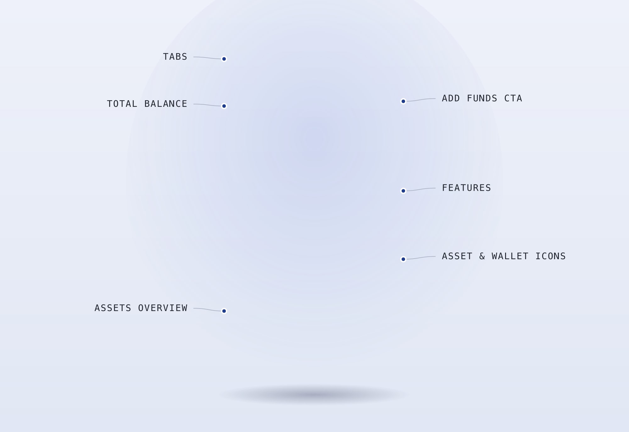
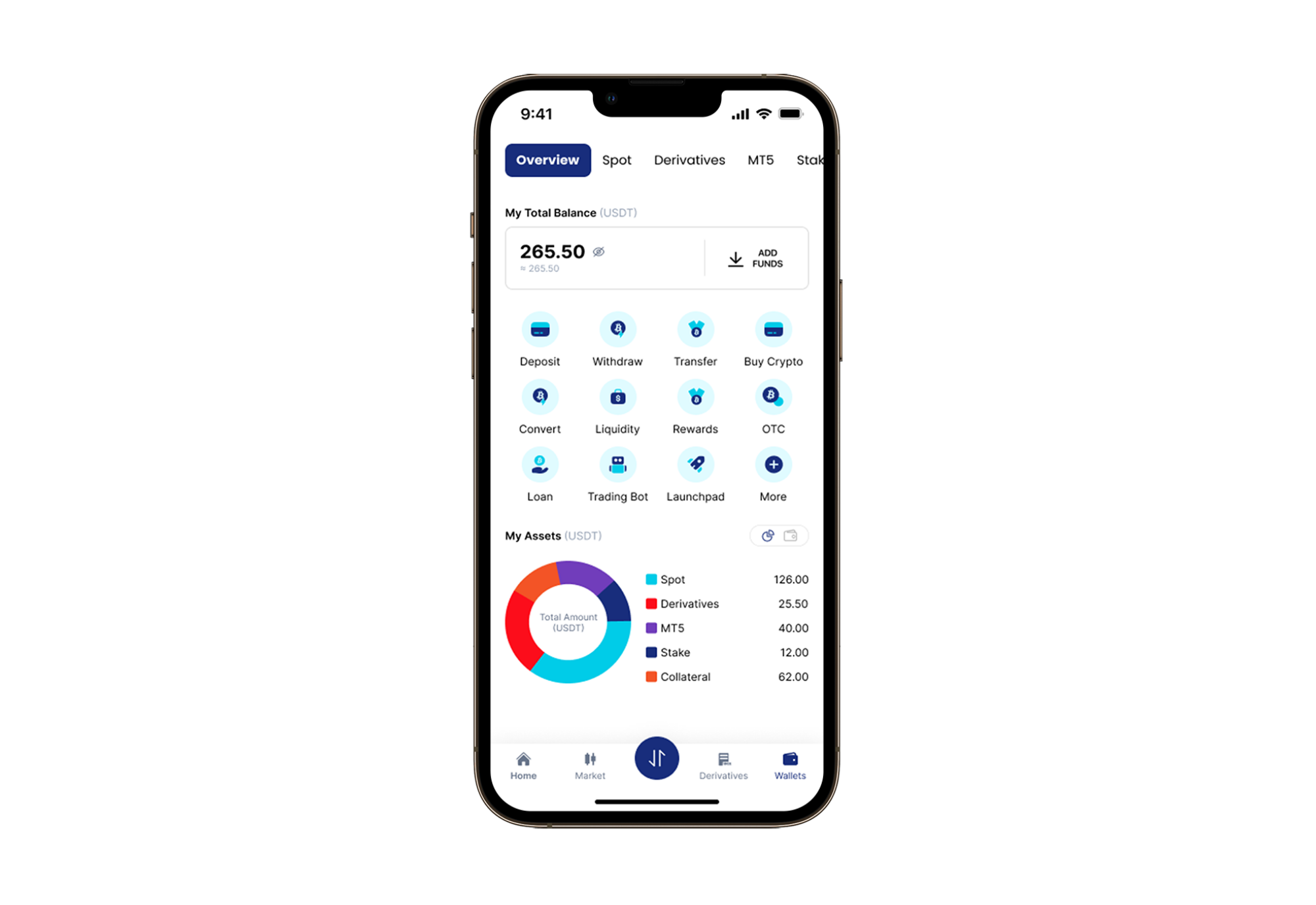
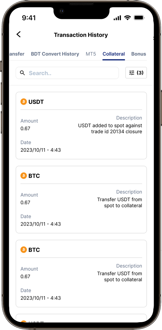
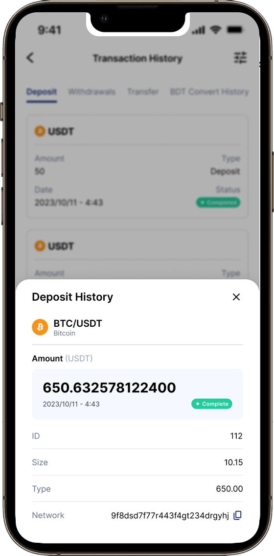
After many brainstorming sessions and iterations, we developed a solution that aligns with our goals and design principles — one consolidated portfolio view, plain-language labelling for every wallet type, progressive disclosure for advanced features, and a single consistent home for the core actions.
The Redesign
Result & Impact
I ran a moderated remote usability test with five participants aged 17–50 — crypto novices and power users — across four core tasks: checking a Spot balance, transferring between wallets, filtering transaction history, and withdrawing with a fee review.
The exact figures are under NDA, but every measure moved in the right direction.
Users praised the clearer interface and flow. Navigation and language consistency were flagged for a follow-up pass, with another round of testing planned to validate the changes.