Dubai Economy & Tourism — Design System
The Visit Dubai website, managed by the Department of Economy & Tourism (DET) of the UAE, serves as an official guide for visitors to explore Dubai's offerings. It is designed to provide comprehensive information, attract global tourists, and enhance Dubai's image as a world-class destination.
- Domain
- Government, Tourism
- Client
- Department of Economy & Tourism (DET), UAE
- Role
- Lead Designer, Design system
- Timeframe
- 48 weeks
- Discipline
- Economy & Tourism, Design System
Context
Visit Dubai helps millions of travellers plan a trip — attractions, experiences, events and itineraries. About half of them navigate primarily by search, so the system behind the site had to be consistent and scalable.
The brief: enhance the design system, and fix the usability and visual gaps along the way.
The problem
The system was built in Adobe XD and had aged badly. Every new project started from scratch — rebuilding the same components, styled a little differently each time.
- 01No single source of truthSame button, six ways — every project rebuilt the UI a little differently.
- 02A fragmented experienceWeb, app and kiosk drifted apart; each team patched its own version.
- 03Accessibility & scale left behindContrast, focus states and scale were an afterthought, never a rule.
- Buttondetached copy6 variants
- Inputdetached copy5 states
- Carddetached copy3 variants
- Nav bardetached copy2 variants
- Tabledetached copydensity · sort
- Chartdetached copy5 types
- Icondetached copy240 glyphs
- Herodetached copy3 layouts
- Footerdetached copy2 variants
- Modaldetached copysm · md · lg
- Tabsdetached copyline · pill
- Badgedetached copy8 colour tokens
XD components — rebuilt each projectFigma — variants & variables
The goal
One unified, scalable Figma system — components, tokens and docs in one place — so design, engineering and product all build from the same source.
Reusable components and tokens — stop rebuilding the same UI on every project.
Strategy
A Design Language System is a shared set of tokens, components and rules. Design reuses them for consistency; engineering integrates them to ship UI faster.
Foundations
The token layer at a glance — type, colour, grid and shadow. Switch tabs and poke at each: size the specimen, grab a hex, change the breakpoint, step the elevation.
Explore Dubai
Display · Dubai · 54/62Dubai Blue #0A3D4E
Desktop 12 columns · 24px gutter · 96px margin
sm 0 1px 3px rgba(10,25,35,.09)
Typography
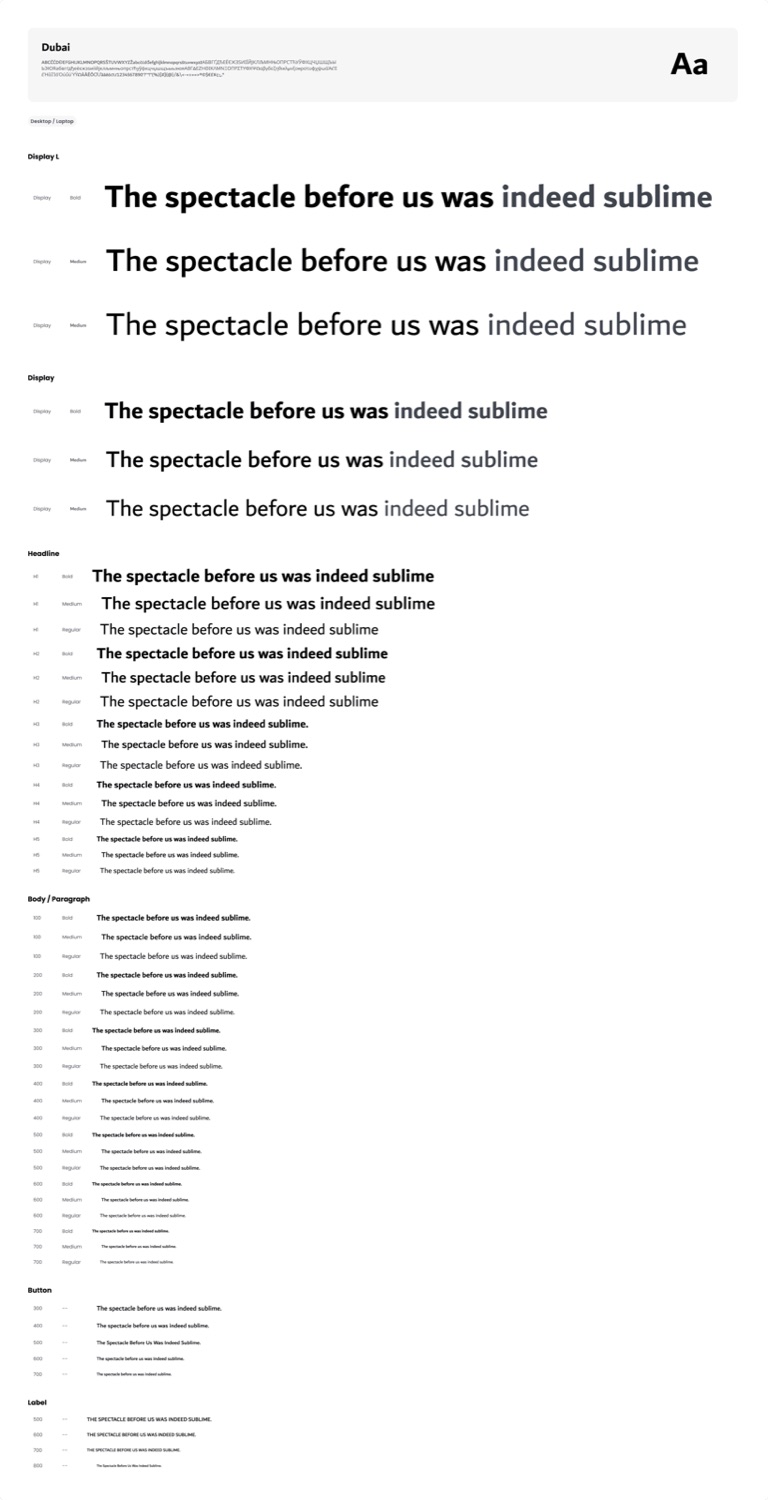
Built on the Dubai typeface — a humanist sans-serif — with Figma variables for family, weight, size, line height, letter spacing and case. Pick a token on the left to size the specimen; the Figma scale is on the right.
The spectacle before us was indeed sublime
Colour
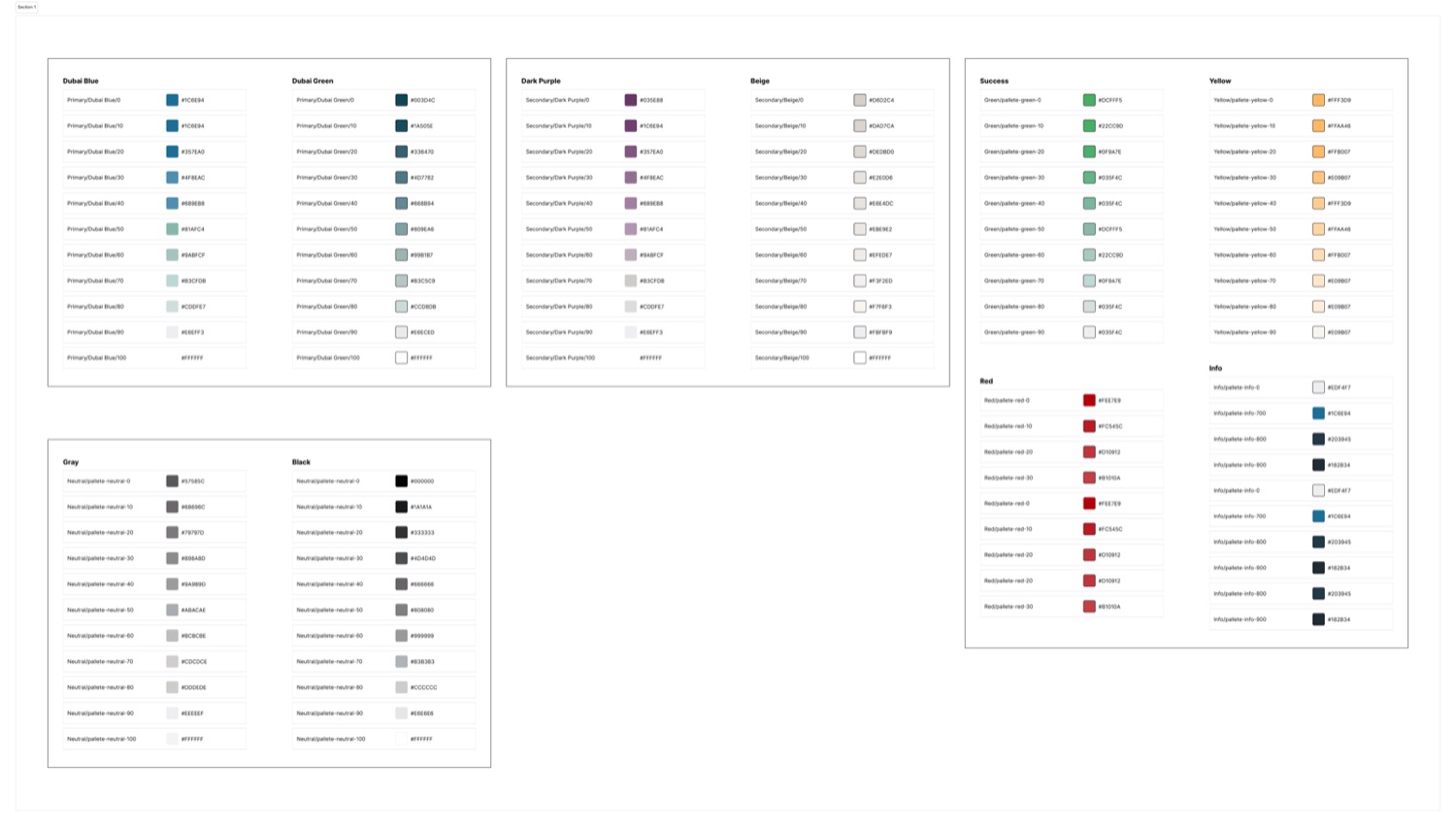
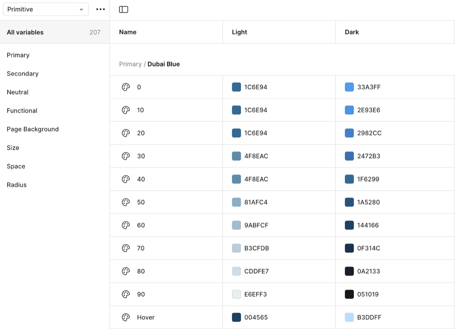
A token-based palette — Dubai Blue and Green, Dark Purple and Beige, plus functional greens, reds, yellows and neutrals — each a 0–100 ramp. The same variables resolve to light and dark. Explore the ramps on the left, the Figma source on the right.
No second palette — the same colour variable resolves to a different step of its ramp per mode. Design and engineering switch modes without touching values.
Icons
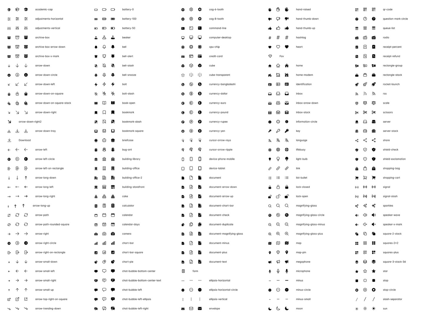
One icon language across the product — navigation, actions, status and feedback, and brand. Hover the set on the left; the full Figma library is on the right.
Grid & layout
One column system, three breakpoints. Every module snaps to the grid and reflows — 12 columns on desktop, 8 on tablet, 4 on mobile. Switch device to watch the same set of modules re-lay themselves out.
Shadow
A six-step elevation scale — from flat to floating. Each step is a single shadow token; click a card to read its value.
0 2px 8px rgba(10,61,78,0.10)Components
The full library runs to 110+ components — 45+ core alone — and past 460 variants once every size, state and mode is counted. From core elements to compound patterns to page modules, every layer sits on the same tokens with auto layout and responsive variants from the start. A sample is below; click any component to view it full-size.
Impact
Moving from XD to Figma reset how Visit Dubai looks and feels — and the team keeps building on the language we laid down.
What I learned
Five things that stuck — open one to read the note.
A shared look and feel lifts both UX and brand — people stop second-guessing the interface and get on with the task.
Cross-functional alignment from day one is what makes a system stick. Retrofitting buy-in from design, engineering and product is far harder than building it in.
Documentation — not the components themselves — is what actually gets a system used. If a team can’t find how to use a token in thirty seconds, they’ll rebuild it.
Begin with the highest-impact components and scale from real usage. Waiting for a “complete” system before shipping any of it kills momentum.
Versioned, governed, shared ownership — treat the system like any other product with a roadmap, not a one-off deliverable that’s “done”.